A Little Color Confidence for Your Next Project!


Hello Reader,

Color pairing is one of those things that feels like it should be intuitive, but honestly? It's a skill. And it's one I've spent years fussing over — swapping out a "close enough" green for the right green, or realizing a card just needed one more neutral to pull it all together.

So I did the fussing for you. I put together 24 On-Trend Color Combinations — six moods, four palettes each — as a free resource.

What's Inside:

I organized these into six moods, so you can grab a palette based on the feeling you're going for, not just the colors:

  • Bold & Bright — high-energy trios for statement cards and playful layouts (hello, Poppy Carnival and Tropical Punch)
  • Soft & Romantic — blush-driven palettes for weddings, sympathy, and gentle everyday cards
  • Earthy & Warm — grounded neutrals and spice tones, perfect for fall projects and rustic style
  • Moody & Rich — deep jewel tones for elegant invites and dramatic layouts (Velvet Twilight is chef's kiss for anniversary cards)
  • Fresh & Airy — light, breezy pairings for spring, baby announcements, and everyday cheer
  • Classic Neutrals — timeless trios that'll pair with pretty much anything in your stash

New More Help? The Color Coach is here!
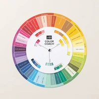
The Color Coach is Stampin' Up!'s version of the color wheel and is based on color theory—the combination of art and science that determines what colors look good together.

One side of the Color Coach has all current Stampin’ Up! colors (except Neutrals) laid out with a spinning wheel in the center. This center wheel gives you monochromatic, complementary, analogous, and triadic information about our colors. The back explains each of these concepts, plus our range of neutral colors.

A Few Tips for Building Your Own Palettes

Once you've played with these 24, you'll probably want to start building your own combos too. Here's how I approach it:

  • Pick your dominant, your accent, and your neutral. Almost every trio in this guide follows that pattern — one color that leads, one that adds punch, and one that grounds it. Think Cherry Cobbler (dominant) + Lemon Lime Twist (accent) + Blueberry Bushel (neutral-ish anchor) in Midnight Confetti. If your card feels "off," it's usually because two colors are fighting to be the star.
  • Let the mood pick the palette, not the other way around. Before I open my ink pads, I ask myself what the card is for. Sympathy card? I'm reaching for Soft & Romantic or Classic Neutrals every time. Kids' birthday? Bold & Bright, no question. Starting with the feeling saves so much back-and-forth.
  • Neutrals are your best friend. Notice how many of these palettes lean on Basic White, Basic Gray, Very Vanilla, or Crumb Cake? A good neutral doesn't compete with your other colors — it gives them room to breathe. If a combo feels too busy, swap one color for a neutral and see what happens.
  • Test with real ink, not just the color names. Stampin' Up! shades can look different in your head than they do on cardstock. I always do a quick swatch test on scrap paper before committing — it takes two minutes and saves a lot of "why doesn't this look right" moments later.

The Hoot Jar!

If you've been inspired by a card, discovered a new technique, or simply enjoy a little Stampin' Hoot fun in your inbox,... Read more

3497 Cambridge Place, River Falls, WI 54022
Unsubscribe · Preferences

Stampin' Hoot!

Stay Inspired & In the Know – Subscribe for card ideas, free resources, special offers, new product drops and more!

Read more from Stampin' Hoot!

What Do I Write Inside the Card? Hello my Hoot-a-Riffic Peeps, I just gave one of my favorite FREE resources a BIG refresh! If you’ve ever finished a beautiful handmade card, opened it up and thought... “Now what in the world do I write inside?”...this one is for you! My newly revamped Words from the Heart Card Sentiment Guide now includes 132 short, card-ready sentiments organized by occasion. You’ll find sentiments for Birthday, Mother’s Day, Father’s Day, Easter, Thank You, Sympathy,...

Hello Reader, Fall is almost here, and I have a FREE creative resource that I think you’re going to love! Sometimes the hardest part of starting a card, scrapbook page, or other paper crafting project is deciding which colors to use. You have all the supplies spread out in front of you... and suddenly every color looks good. Or none of them do. 😂 That’s where this little resource comes in! download the 24 color combinations pdf here 24 Fall-Inspired Color Combinations I’ve put together 24...

It’s here! A Stampin’ Pretty & Stampin’ Hoot Product Share Collaboration featuring brand-new goodies from the 2026 September - December Catalog and July/September Online Exclusives. This is your chance to get a taste of it all—Designer Series Paper, Ribbon, and even Two-Tone Cardstock—without purchasing full packs. Perfect for trying everything before you decide which must-haves deserve a full-size spot in your craft room! Holiday shares will be shipped on or before September 25! NEW PERK!...